My Completed WordPress Website

After 12 weeks of stopping, starting, stopping, restarting, seeking help, and restarting again, I was finally able to create a WordPress website using the Classic Theme.
The main goal of the course was to create a WordPress site using a custom theme. We could use the Classic Theme method or the new Block Theme Method. I decided to try the Block Theme method…and ended up not being able to have my site render at all. 😭
It showed what I wanted the site to look like on one screen, but then showed nothing on the front end. It also didn’t help that WordPress updated in the middle of our course, so everything we were learning didn’t match up to any of the official, or YouTube created, tutorials we were using in the course. And I sadly found this out when I was working on my homepage design Easter weekend - no one was around to help me and nothing was working.
I ended up turing in what I did have (which wasn’t a lot) and asked my professor for help in a follow-up email explaining my problems creating the site. Luckily, he gave us some more time to work on the site since it was a holiday weekend and he realized he had a few students that were having trouble getting Block Themes to work.
He suggested I try creating a Classic Theme instead and gave me some videos to follow that could assist me as I worked through my site. Luckily, this worked out the best and I was able to get everything completed!
background info
I wanted to create a website that I could use to post book and movie reviews. I’m always reading and seeing great movies, so I wanted to share what I read and watched with others. I researched some other sites that did book and movie reviews or had the option to post reviews of what you watched. I ended up liking the header layout for Letterboxed, the details for each movie on RottenTomatoes, the choice of colors for Goodreads, the ease of finding information on TheStoryGraph, and the layout showing the piece of entertainment’s poster, rating, and information on Metacritic. I decided Metacritic was the website I would get the most inspiration from, along with some ideas I came up with after looking at the other competitor websites.
Colors, patterns, styles, and Layout
I decided to go for a simple layout that has all the information of my reviews front and center. My professor suggested I go for just book reviews OR movie reviews, so I decided to go for book reviews since that’s a lot easier to do with my nearest theater now being 40 mins away. 😅 I have more than enough information to add to the site since I write my own short to medium length reviews on Goodreads and TheStoryGraph, so having enough content wouldn’t be a problem.
I decided to go to with light colors with one darker color for contrast. My goal was remind someone of a small local bookstore or of a “cozy” video game like Animal Crossing or Stawdew Valley. I wanted to have the book covers be the majority of color used on the website so they can be the most eye catching piece of content. I also wanted to have the formats/genres of the books to be links so the user can click on those and see all the books that fall under that format/genre.
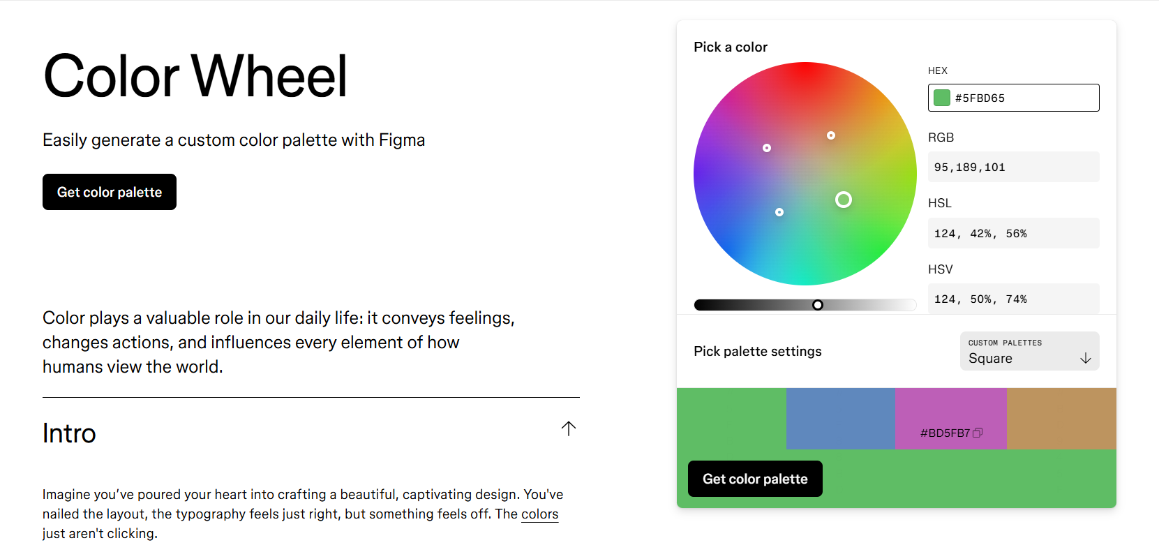
I used Squarespace’s Logo Creation Tool to help with creating a logo for my website. I liked the logo and the font that was used, I ended up going with both. So here’s my logo - a book shelf with small objects on it using the font Cantarell.

I created the layout for the book review section so I could get the idea out of my head. I used the simple parts of what Metacritic and RottenTomatoes, making sure the book cover is the prominent part of the review area. My hope was to have the area be a slider so it shows a new set of reviews with each click until you come to a button that says “See All Reviews” so you can go to the main Book Reviews page.

I creating a set of wireframes in Balsamiq to get the general idea of what I wanted the site layout to be. I knew once I did this that my site would end up changing, but at least it’s out of my head and can be edited as needed.


The Homepage
After getting my classic theme set up, I ended up going with a simple design for the header, and a similar but edited design for the book review and blog areas. I created an image in Canva for my picture in the header and found a frame that reminds of me fairy taleswhen you look at it.
I originally had a section for my “Newest Reviews” and my “Recent Reviews” thatI’d hoped to have refresh to show random reviews each time you visited the homepage. But my “Newest Reviews” section ended up not updating, even after changing the code. So I decided to remove the top book review section, rename “Recent Book Reviews” to “Newest Book Reviews” and expanded the section to show more reviews on the homepage.

BEFORE
Showing the “Newest Reviews” and “Recent Book Reviews” sections on the homepage.

AFTER
“Newest Reviews” is now the only section being used for book reviews and now shows 12 reviews instead of three.
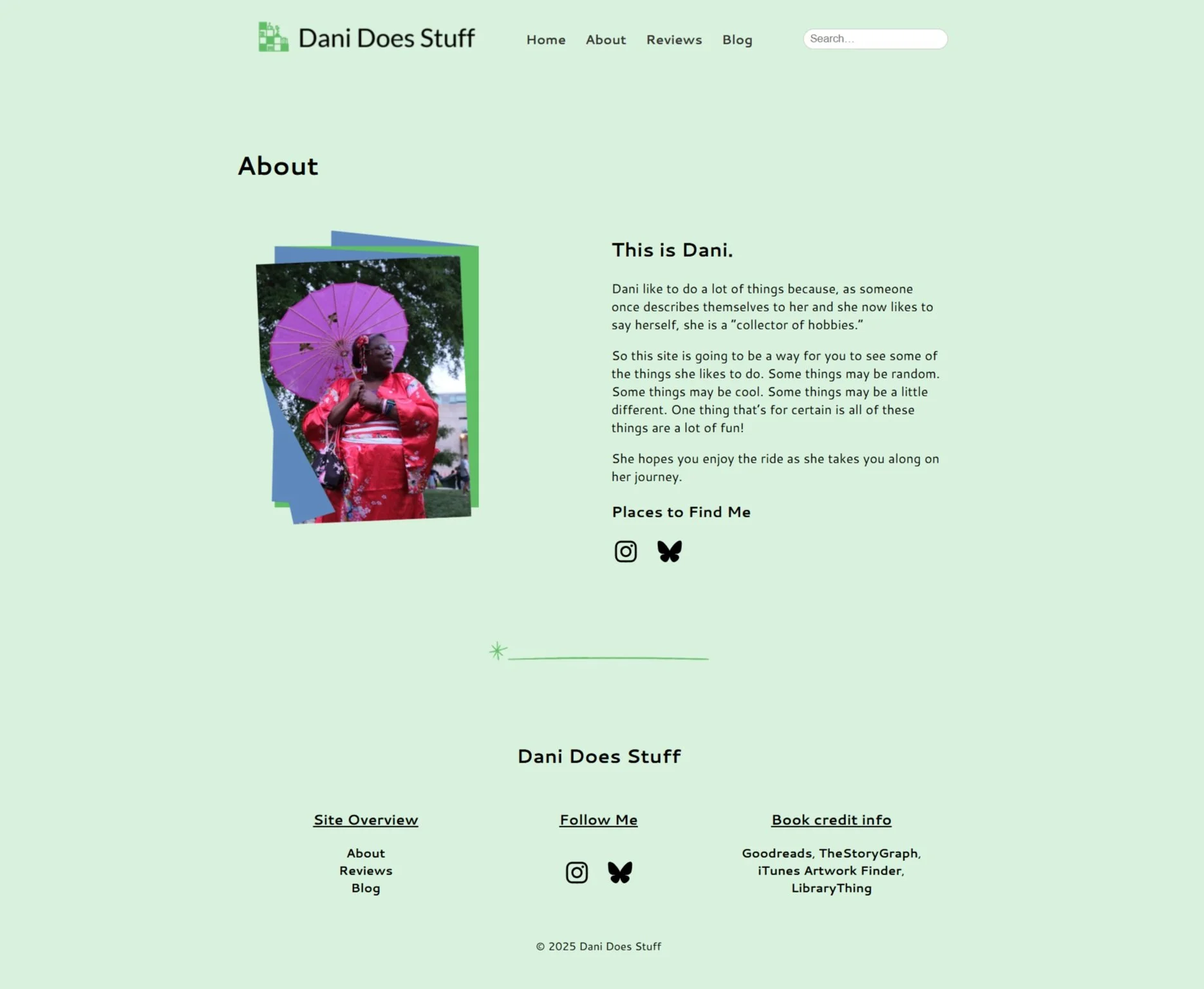
About Page
I wanted to keep my About page simple with a different image of myself, also created in Canva, a small section talking about myself, and social media links at the bottom of the description area. I think this was the easiest area to set up and the was a fast page to complete. The image is me cosplaying in one of my fashion kimono at an event at the Virginia Museum of Fine Arts. We were really lucky that day since the event ended right before it started severely raining. But before that, a lot of fun was had by all.
Book REviews PAge
I think this is the page that changed the most from what I originally had planned in my wireframes. I ended up removing the bordered background for each section since I felt it would overcrowd the area as you read through each review. I did manage to get the links to the different formats to work here (for some reason they’re not working on the homepage and I’m not sure why), so when you click a format link, it takes you to an archive page showing all the books that fall under that format. Each book review is created with a custom post type, using the plugins Meta Field Block and Advanced Custom Fields to show the author, rating, and formats on the page. The layout is created using a layout native to WordPress, so a custom loop didn’t need to be coded in VS Code. I feel like I could still do more with this page and plan to edit it further in the near future.

Book Review Page
Showing the reviews with the book info and the format links.

Format Link Result
What you see when you click on a format link. It uses the archive page layout to display the book reviews that match the link.
Book Review Page
I’m having some trouble getting all the information showing on my Book Review page at the moment. My plan was to have the same information on the Book Review page that shows a running list of reviews as I complete them, but to have a main review page in case someone wanted to link to the main page from a blog post. Sadly, the Advanced Custom Fields and the Meta Field Blocks seem to show up twice when I try to get this set up to show on both pages, as well as on the home page. I’m not really sure why that’s happening, or how it’s happening at the moment. It’s definitely an interesting bug that I’m looking forward to investigating. As much as I like the layout of the single book page, I may end up disabling the link until I have the additional fields fixed and showing up correctly on the page. I may end up showing just the author, rating, and formats on the running review list and a link to the main book review at a later time, but I do like how things work right now.

Blog Page
My blog page is very simple, where you can see the posts I’ve made along with a featured image for the post, a brief snippet of the post content, and a “Continue Reading” link to go to the main post page. The Post page is just as simple - featured image at the top with the content and any additional images that follow. I wanted to make sure it was easy to get back to the main blog page, so I created a button to take you directly there at the bottom of the post. Out of all of the pages for my theme, this was the one I wasn’t sure what how I wanted to have the end result look. I knew I wanted to have the title, the date of the post, featured image, and content set up in that order, but outside of that, I didn’t have a lot of plans on what I wanted things to look like. I currently only have two posts for my blog so I could make sure it was setup and working correctly, but I felt the main focus of the site was more the book reviews and not the blog posts, but I still wanted to have a place to talk about some of my other hobbies that I do. It may include some movie reviews, but I’m not sure yet. Overall, the simple layout turned out really well in the end.
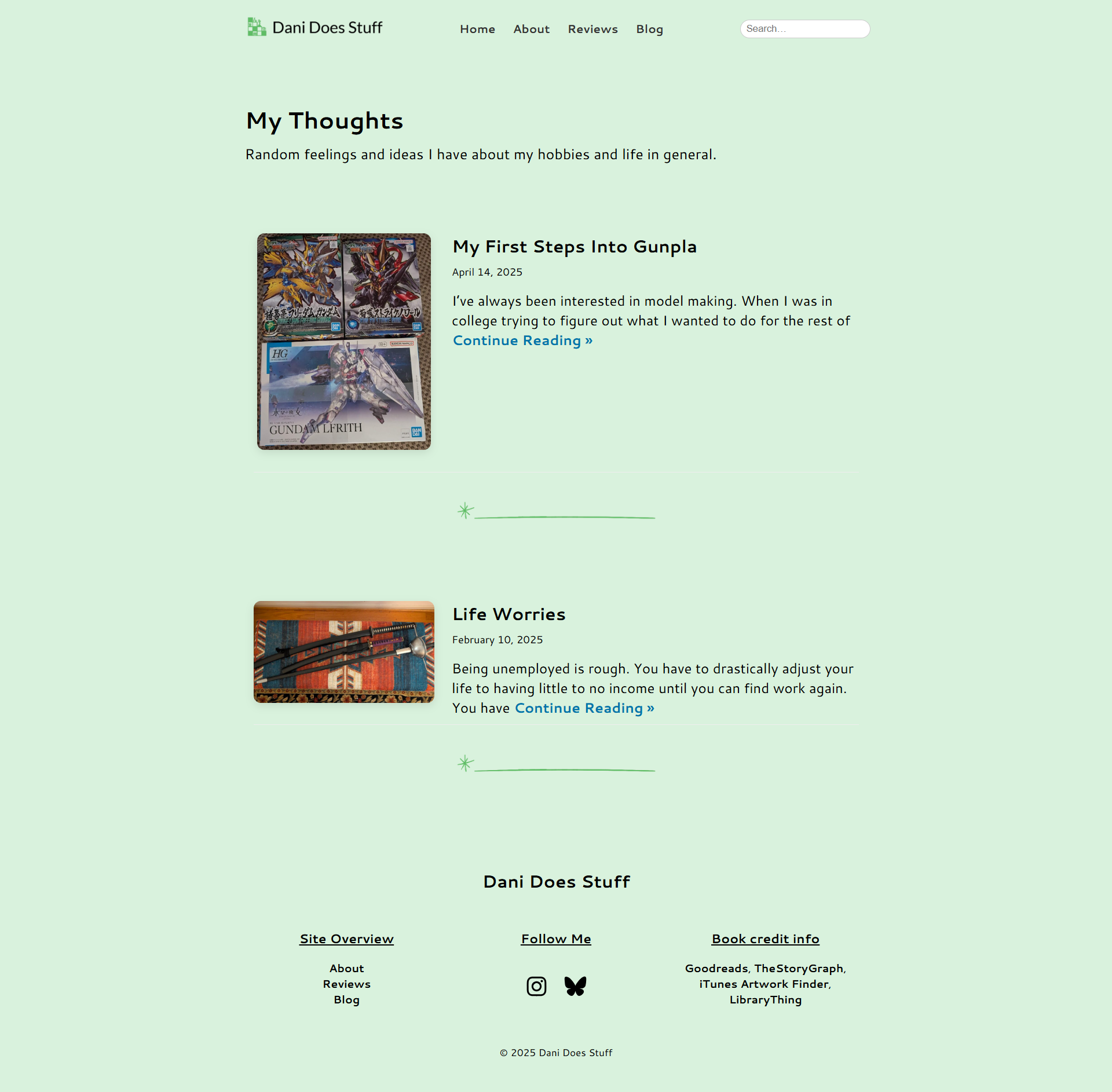
“My Thoughts”
My simply-made blog page to show my posts list.

Post Page
A general layout for my blog posts. My focus was more on the book reivews, but I wanted a place to show my other hobbies as well.
Search Results Page
Lastly, one of the pages I wanted to fix first, since it was a page I didn’t realize wasn’t working until I created my final project video going over my project, was the search results page. I had no idea what I needed to do to get this page working, but had an idea it was going to involve creating a page specifically for displaying search results and it would use “searchresults.php” as the template page. I was partically correct with that line of thought, since it does use a specific search results page, but uses the layout for the archive page. So I just needed to copy over my code and layout for my archive page, change some of it around so it works with my search results when using the search bar in the menu, and display the results or show “No results found” if nothing matches the query. It was really simple to set up and I was glad I figured out a lot of what I needed to do on my own. It showed me I knew what I needed to do and understood how to set things up so they worked. I just needed to know some of the details like how to link it to my search bar and how to do the layout of the page. It still needs to be refined a little bit more, but for what I needed it to do, it works.

Final Thoughts
Overall, I learned a lot from this course. I finally learned how to create a Classic Theme after several years of not being able to make one on my own. I got my styles to work on my pages without too much trouble, and got to get them fixed when they were not working too. I feel I finally have a foundation for being able to make custom Block Themes now that I have a handle on how to make a Classic Theme. I also have two YouTube resources that can help me create Block Themes now, that are new as of April/May 2025, so I’ll be able to use updated code for my site and ask for help if needed.
I also feel like I’m having fun coding again - it’s been a while since I could say that. I’m hoping I can roll with this for a while and continue learning more about WordPress and how it works.