Objectives
Meet the web standards set by Virginia Commonwealth University
Have the site be responsive so it can be viewed on multiple devices
Tech Used
Baslamiq
Brackets
Bootstrap 3
Github / Github sites
National Core Indicators (NCI) is a grant funded program that is part of the Partnership for People with Disabilities – a non-profit that is a part of the School of Education for Virginia Commonwealth University (VCU). This program collects and analyzes data from people with disabilities, their families, and their providers.
I was tasked with redesigning their website to meet the web and accessibility standards as required by VCU, as well as increase user experience and have the design be responsive.
Research
I reviewed the original website to get an idea of what information was displayed on the site and the use flow of each page. I came to find out the site was indeed not responsive, used tables to display its information, used colors that, even though being part of the NCI logo, were harsh on the eyes when looking at the site, and was using deprecated HTML methods.
I also noticed the area in the middle right of the site was the only area that really changed its content as you viewed each page, with only 1-2 pages having the navigation on the right changing to reflect additional options to view related material.
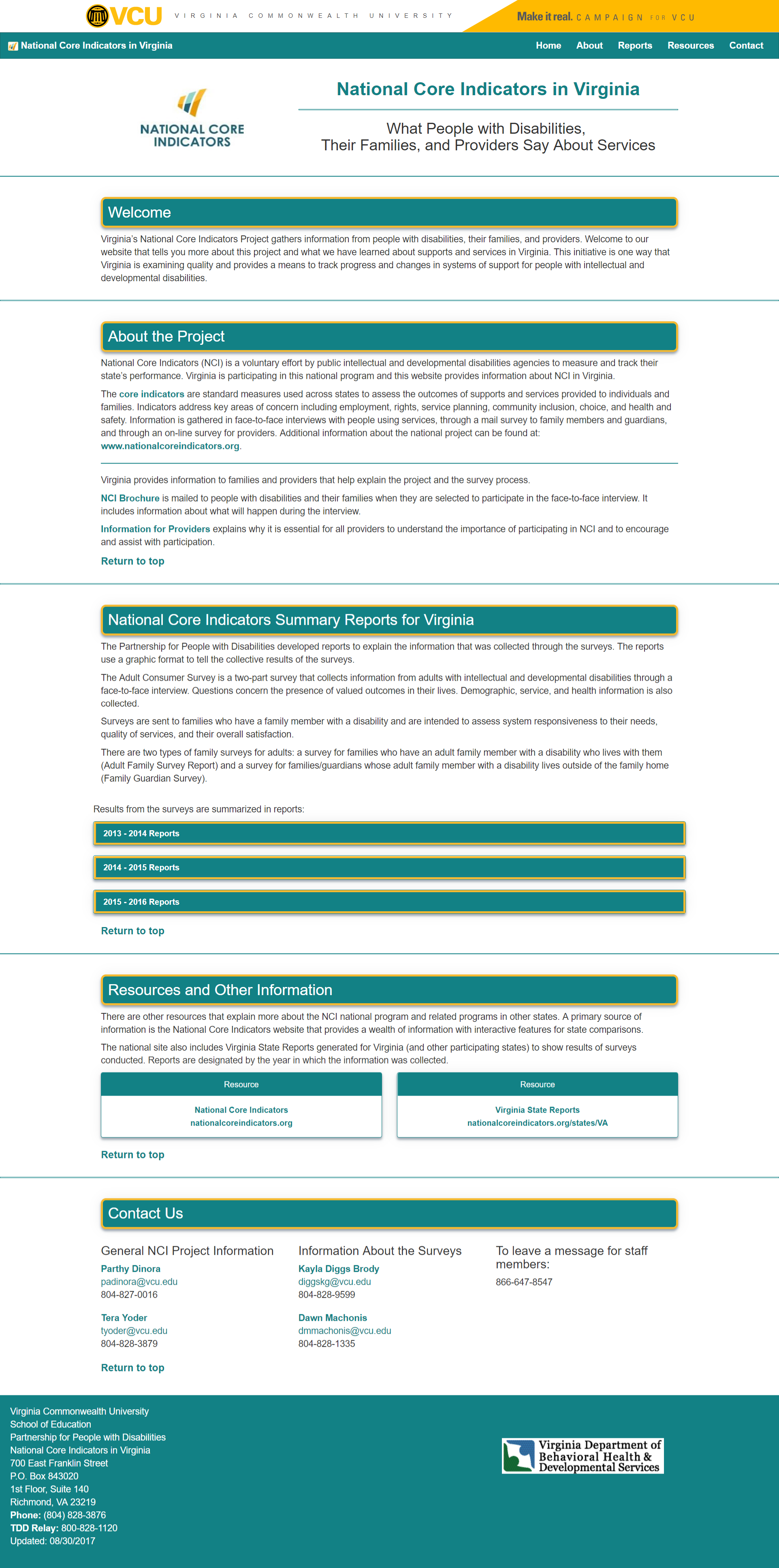
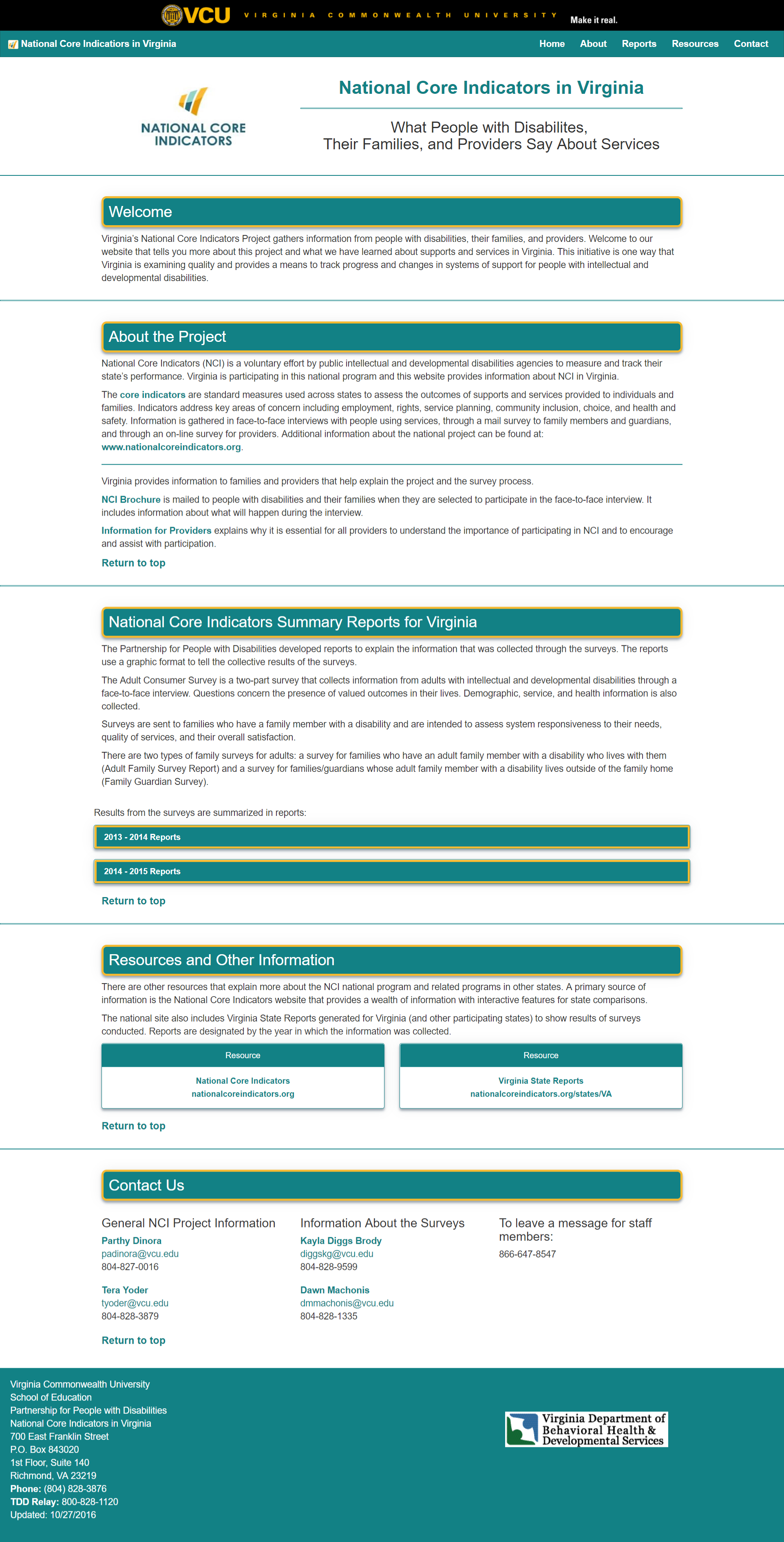
I noted what information was shown on each page and the navigation that was viewable for that page’s content. After seeing how much of the information for the site’s content was mostly informational, and the navigation stayed the same aside from 1-2 pages that needed additional links, I decided a one-page informational site layout would work out best for the site redesign.
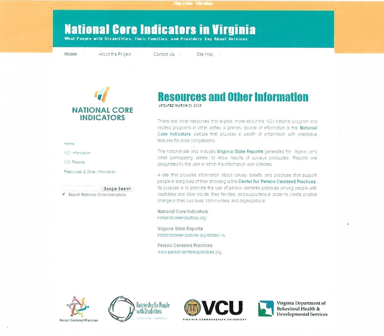
The original site
This is an example of the original site. The content of each page is found on the right side of the site with the main navigation at the top of the screen and the side navigation to the left. The logos of the partners involved with NCI can be found in the footer.
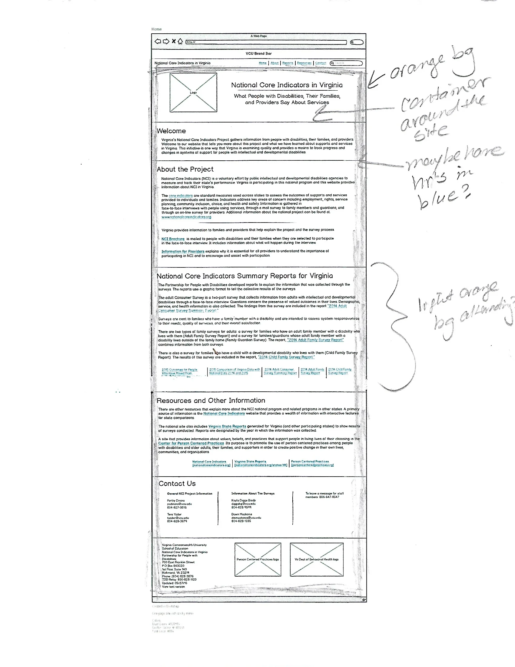
Wireframe
I then used Balsamiq to create a one-page layout using the navigation on the original site as a guide for the placement of each section and its available content.

Sitemap
I also created a simple site workflow to fulfill the project requirements as given by my supervisor.
Initial Mockup
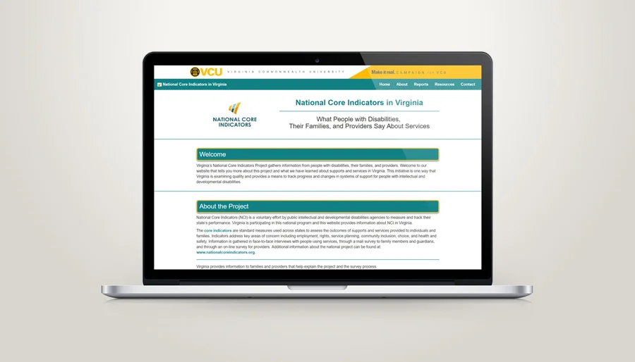
I also kept in mind how the site needed to be responsive, and decided the best way to quickly create the initial site mockup would be to use Bootstrap 3. I used the same colors from the original site in the redesign, with some changes. I toned down the golden yellow and used it mostly as an accent color as well as upped the usage of the dark green as a prominent color of the new design. I also made sure to check the VCU web standards as I worked through mockup to make sure all the requirements were met.
Initial Client Response and Site Improvements
The initial response from the NCI team was not a positive one. The one-page layout, color choices, and the need for the site to be responsive was not received well. Many of the members wanted to have the site look like the original version and did not understand the need for the site to be responsive.
I read each emailed response I received and composed my own response email explaining my design choices, VCU’s web standards, and why the site needed to be responsive. The next day, I met with each member of the team and addressed each of their issues as mentioned in their emails. One member of the team did not have a smartphone, had never used one, and did not understand why anyone would want to look at a website on a tablet or on their phone. I explained how websites were now viewed on different devices and how the site needed to be responsive so it could be viewed properly.
Other concerns were the way the links to the documents on the site were displayed and the color choices for the site. I used the feedback I gained from each team member to update the layout of the document links and used a little more of the golden yellow color to bring attention to some areas of the site. The updates were well received and the site was given the go ahead to go live.
Conclusion
This was the first website I have worked on that was not well received by the client. I was very glad I had a good understanding of VCU’s web standards, and an advanced understanding of the technology I used to create the site, to be able to defend my choices and even improve upon them so the client was content with the end result.